UX Research &. Website Experience Design
Think Globally, Act Locally
A Swiss manufacturer of highly technical products, served customers across industries ranging from stone and construction to glass, manufacturing and floor maintenance.
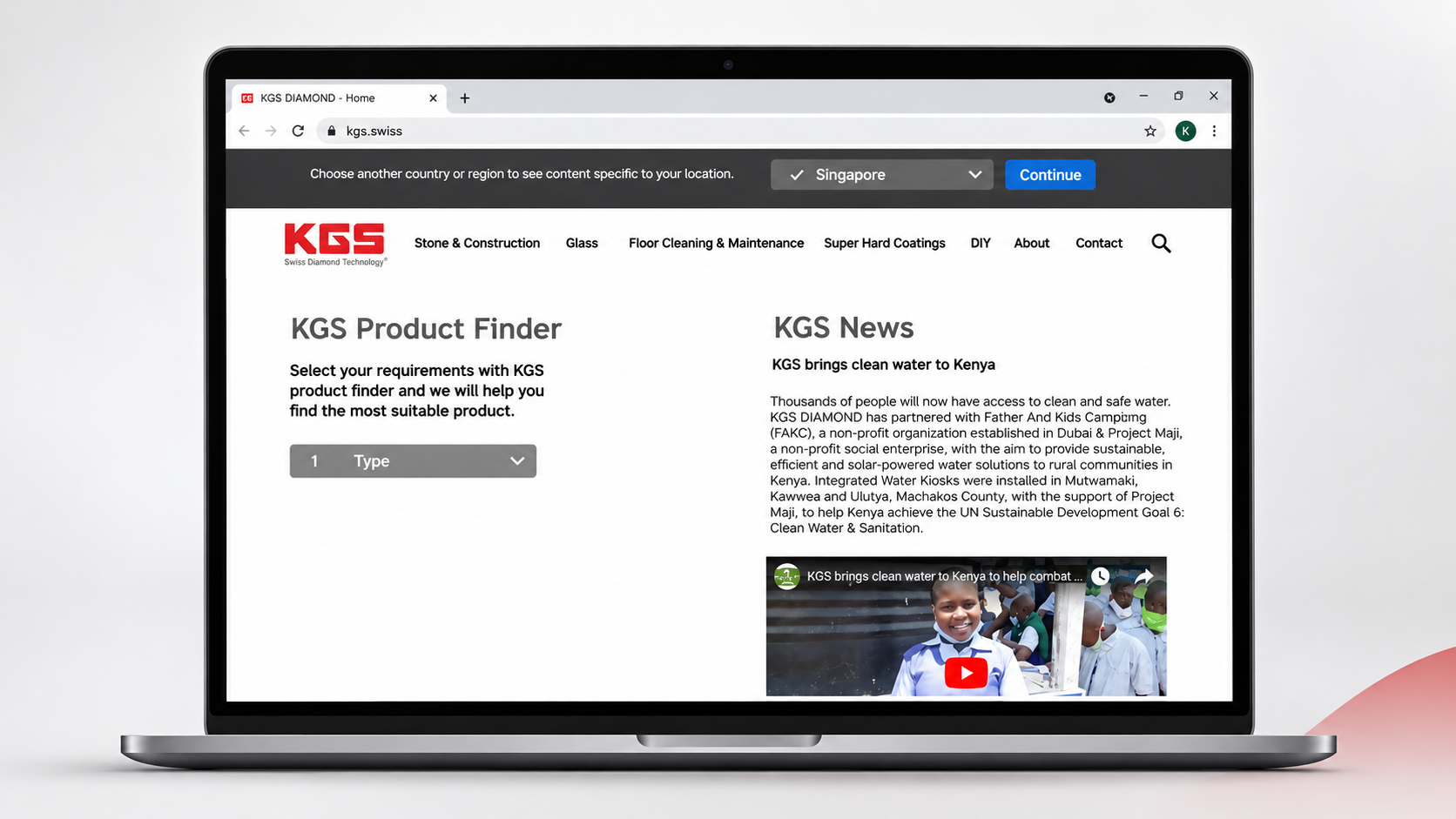
With such a diverse product portfolio, the company's global website had become difficult to navigate. Customers struggled to understand the product range, find relevant information and identify the right tools for their applications.
Our challenge was to rethink how KGS presented its products online, creating a more intuitive digital experience that could serve different audiences and markets while supporting the company's global business strategy.
Role
UX Designer & Project Lead
Responsibilities
User Research / UX Strategy / Information Architecture / Wireframing & Prototyping / Usability Testing / Stakeholder Coordination
Key Deliverables
Website Experience Strategy / User Personas / Information Architecture / Product Categorization / Product Finder Concept / Low- & High-Fidelity Prototypes
Year
2022
Research & Key Insights
Understanding how different customers navigate complexity
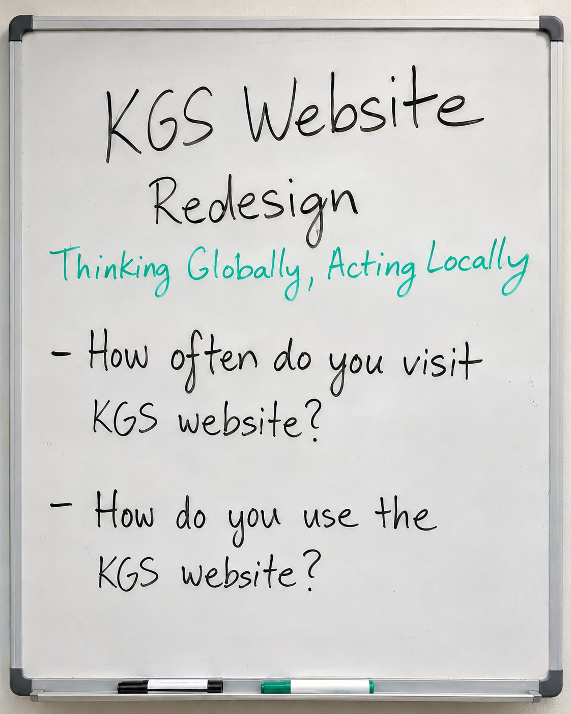
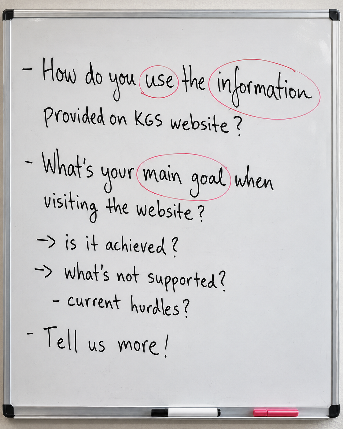
We started by looking at how people actually used the existing website. Website analytics revealed a high bounce rate, while interviews with customers and stakeholders across Southeast Asia and Europe helped us understand where users were getting lost.
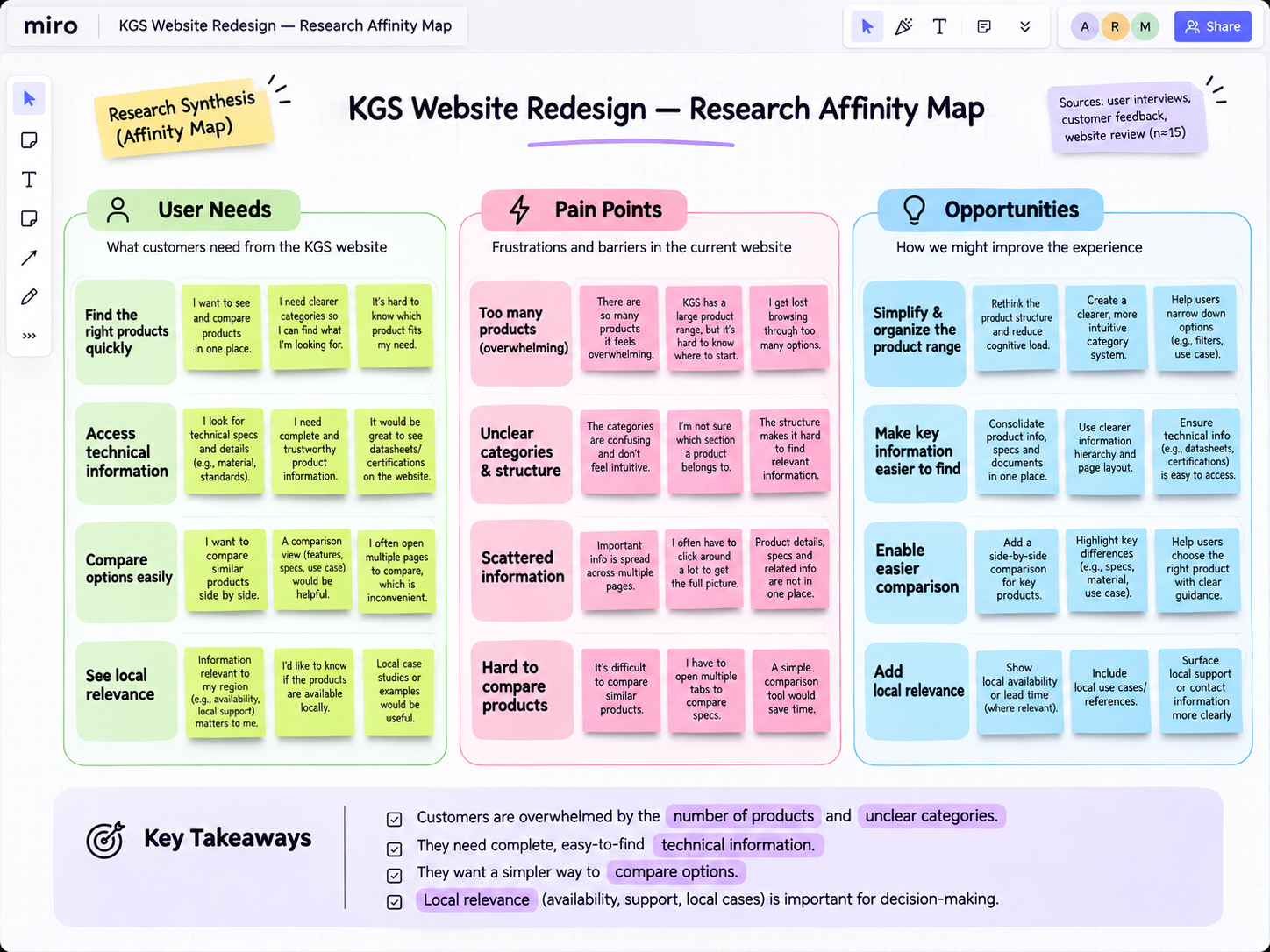
The research revealed three key challenges:
01
Too many products, too little clarity
KGS served very different industries, each with its own terminology, applications and technical requirements. Customers often struggled to understand which products were relevant to them.
02
A global website that didn't respond to local needs
Markets differed in their product offerings, applications and customer expectations, yet the website presented largely the same information everywhere.
03
A frustrating experience that risked losing customers
With information scattered and navigation overwhelming, customers struggled to find the right products. Rather than continuing their search, they could leave the website and turn to competitors offering a simpler experience.
The opportunity was not simply to make the website look better. It was to rethink how information was structured around the way customers searched for solutions in order to retain happy, returning customers.
Rethinking the User Experience
Making a complex product portfolio easier to navigate
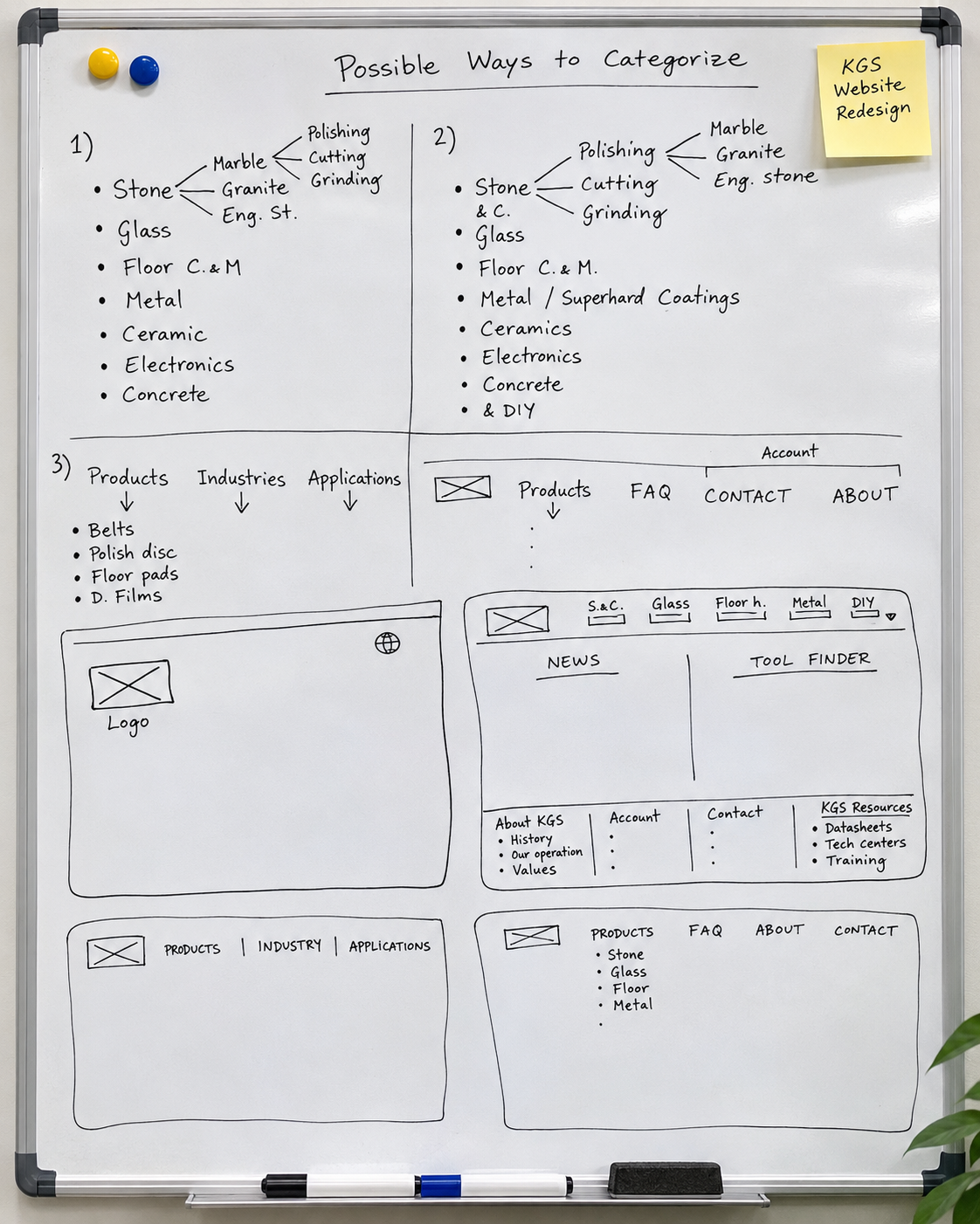
One of the biggest design questions was how to organize the product range.
Should visitors begin with the industry they worked in, or should they first choose between products, industries and applications?
Both approaches made sense from a business perspective, but we needed to understand which would feel more natural to customers.
I explored different navigation structures and early wireframes, working closely with product managers to understand the relationships between industries, applications and technical specifications.
We also studied websites from companies such as 3M and Saint-Gobain, looking at how other manufacturers presented complex portfolios to different audiences.
Two directions emerged:
01
Industry-led navigation
Allow customers to begin with familiar categories such as Stone & Construction, Glass or Floor Maintenance, helping them recognize immediately that KGS offered solutions for their industry.
02
Flexible Product Discovery
Give visitors different entry points through products, industries and applications, accommodating customers who knew exactly what they needed as well as those still exploring possible solutions.
These concepts helped us move from an internally organised product catalogue toward a structure shaped by customers' needs.
Prototyping & Testing
Finding the balance between simplicity and technical accuracy
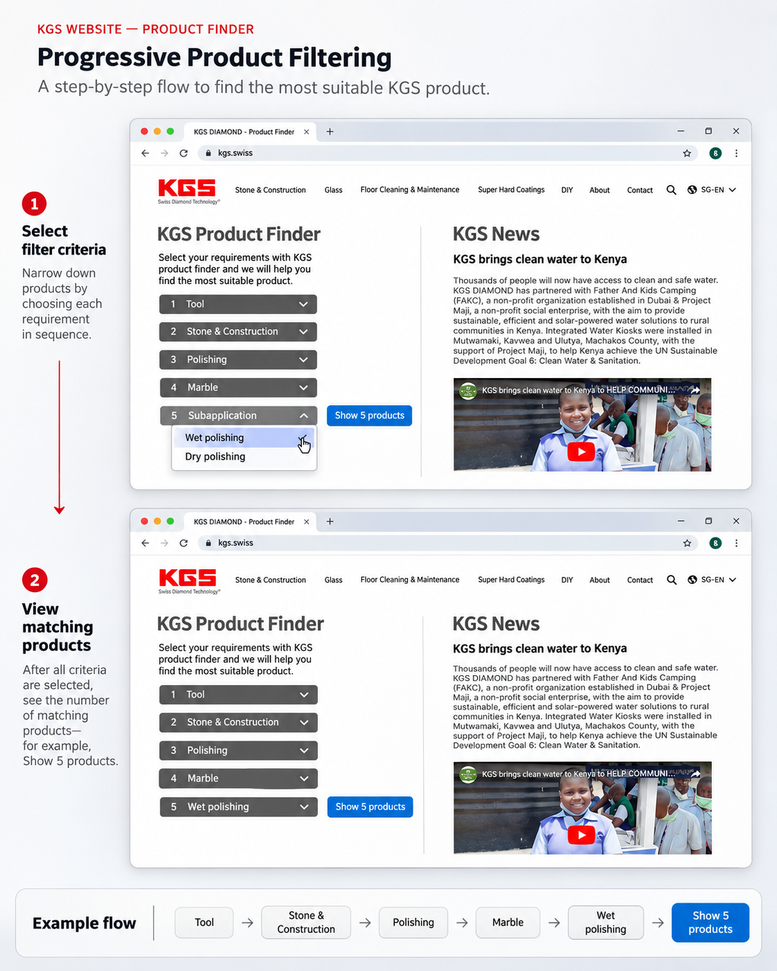
We developed low- and high-fidelity prototypes to explore the proposed navigation, regional website experience and product finder.
The product finder was particularly challenging. It needed to help customers narrow down a large range of technically similar products without recommending the wrong tool.
Working with product managers and wider design, marketing and IT teams, I refined the product categories and tested different navigation approaches with users.
Testing focused on whether people could select their region, understand the main navigation, find relevant products and use the product finder confidently.
The findings were encouraging: 98% of participants found the homepage intuitive and could navigate to the information they were looking for. Most also preferred seeing industry categories prominently in the navigation.
However, testing revealed that the product finder wasn't consistently accurate. This was an important reminder that an intuitive interface is only valuable when the information and recommendations behind it are reliable.
Outcome & Reflection
One global brand, different local customer needs
The project established a clearer direction for KGS's digital experience, combining simplified product navigation with a framework for region-specific website content.
The proposed experience made it easier for customers to explore products through familiar industry categories, while the product finder offered a more guided path toward relevant solutions.
Further work was identified to improve the accuracy of product recommendations and continue testing the information architecture.
For me, the project reinforced an important lesson: good UX isn't just about making information easier to find. It's about understanding how people think, how a business operates and where the two need to meet.